Content Architecture Example
Scenario:
My client needed a completely new content set that encompassed all teams and all bodies of work they performed. Their existing content included policies and procedures that were stored on SharePoint. The employees had difficulty finding relevant content, and some employees had saved older versions to their local computer. As a result, there were many versions of the same procedure floating around, and many employees were using outdated procedures.
Solution:
I created a full content set and published it on the internal wiki. To do this, I:
- Interviewed business leaders and subject matter experts to research detailed content requirements
- Wrote playbooks to instruct personnel in the correct performance of various work activities, document best practices, and link to other online resources
- Designed visual elements including diagrams to illustrate and clarify concepts
- Built the content architecture in a way that is meaningful, intuitive, and clear, leading the user from the big picture to detailed information
The wiki platform was critical to supporting:
- Content architecture
- Flexibility
- Linking to and discoverability of both the new content and other resources
- Visually appealing content
- A positive user experience
Key features of the content design included:
- One voice
- One tone, one writing style to unify the experience for the reader across different pages and subjects, lowering the “price of admission” to understanding the content
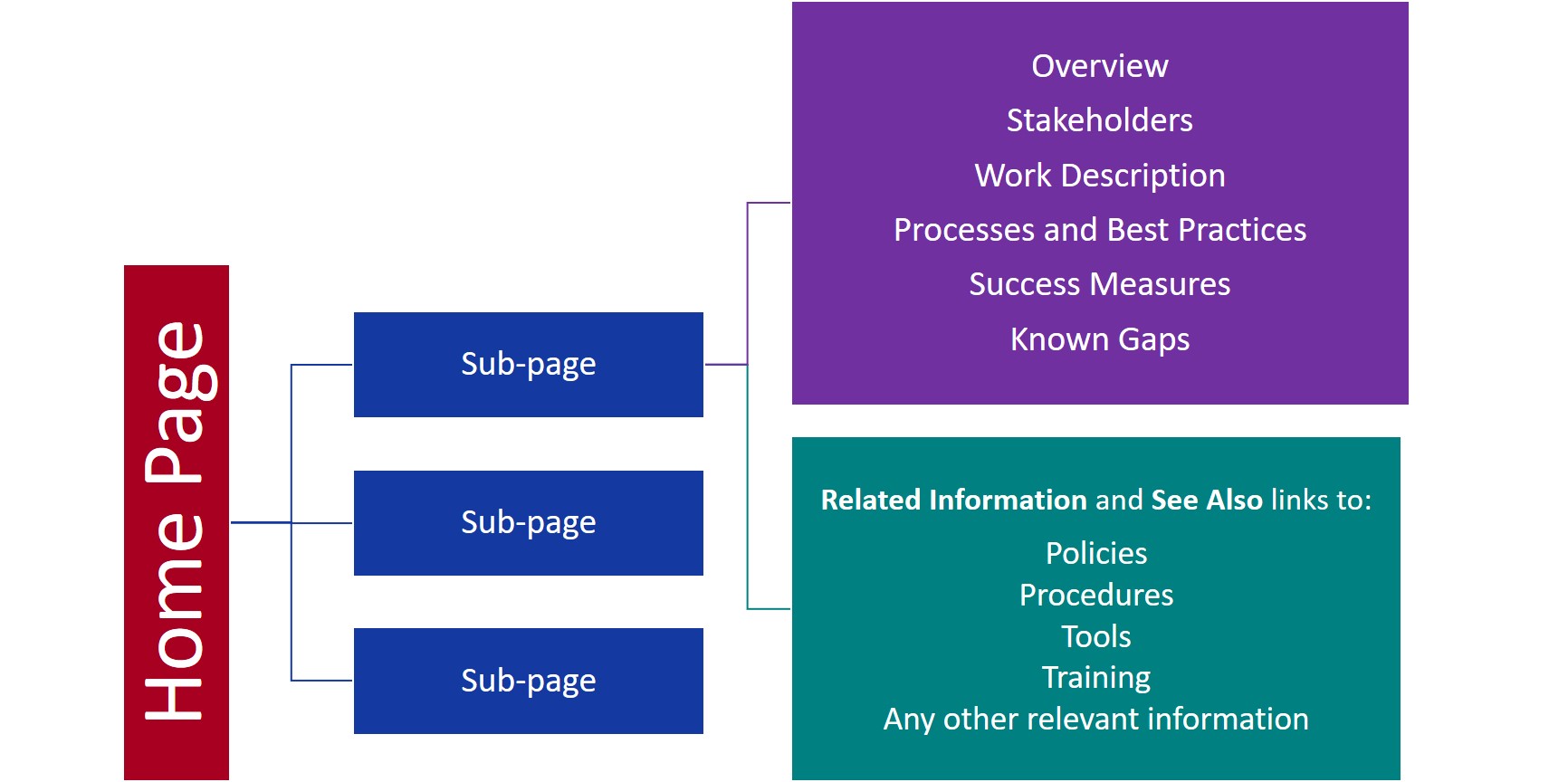
- Reliable structure for Home pages and sub-pages
- The Home page showed the “forest”—the broad view of the body of work. The sub-pages showed the “trees”, giving more detail in a specific area of that body of work.
- All home pages included:
- Role-based org charts
- Cross-team diagrams
- Team leads (also included on sub-pages)
- Once a reader was familiar with content for one body of work, they knew what to expect in other parts of the content. This also lowered the “price of admission” to understanding the content, and it meant readers didn’t have to hunt around to find the same type of information for a different body of work.
- Color-coding for context
- This feature helped readers understand relationships with their client, their own company, and third-party vendors. See Color-Coding to Simplify a Complex Environment for more information.
- Tooltips to define acronyms and terms which popped up on mouse hover
- This feature provided the best experience for all audience members.
- Defining acronyms and terms helps anyone who is unfamiliar with them, whether a new employee, or someone from a different team.
- At the same time, since they only appear when you hover over them with your mouse, a more experienced team member can read without any static notes within the content that clutter and obscure the main concepts.
- Illustrations, diagrams, and process flows
- Another important aspect of lowering the “price of admission” was using visuals that added clarity, and that helped the reader remember what they learned.
- I often used Home page diagrams which showed the complete process flow or concept, with related sub-page diagrams to show relevant detail for that specific area of the work.
- Feedback mechanism
- This feature supported continuous improvement and responsiveness to the voice of the customer (the audience for the content).