Training Site Homepage
Project description
The overall goal of the project was to redesign the MuleSoft training homepage to make it easier to use and understand, as well as accessible.
Project goals for content design
For the UI text, we wanted to:
- Improve call-to-action (CTA) button text to be more intuitive
- Improve user understanding of the different training MuleSoft offers
- Increase the users' success in finding the courses they want
- Communicate the benefits they gain from training and certification
My role
I was the sole writer for this project, with input and feedback from the team to refine the UI text.
Partners
Designers, marketing, developers
UX Improvements
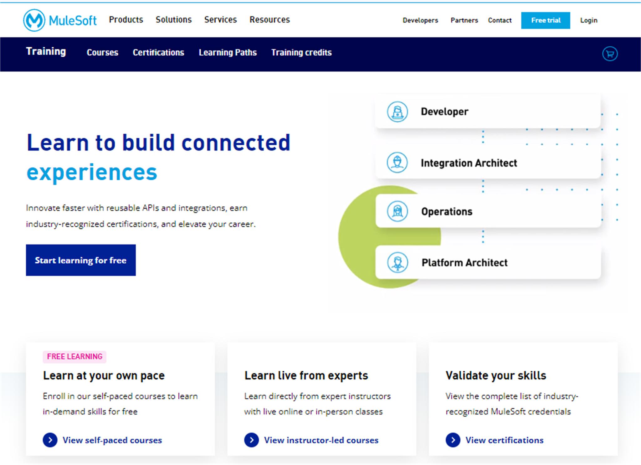
1. Improve CTAs
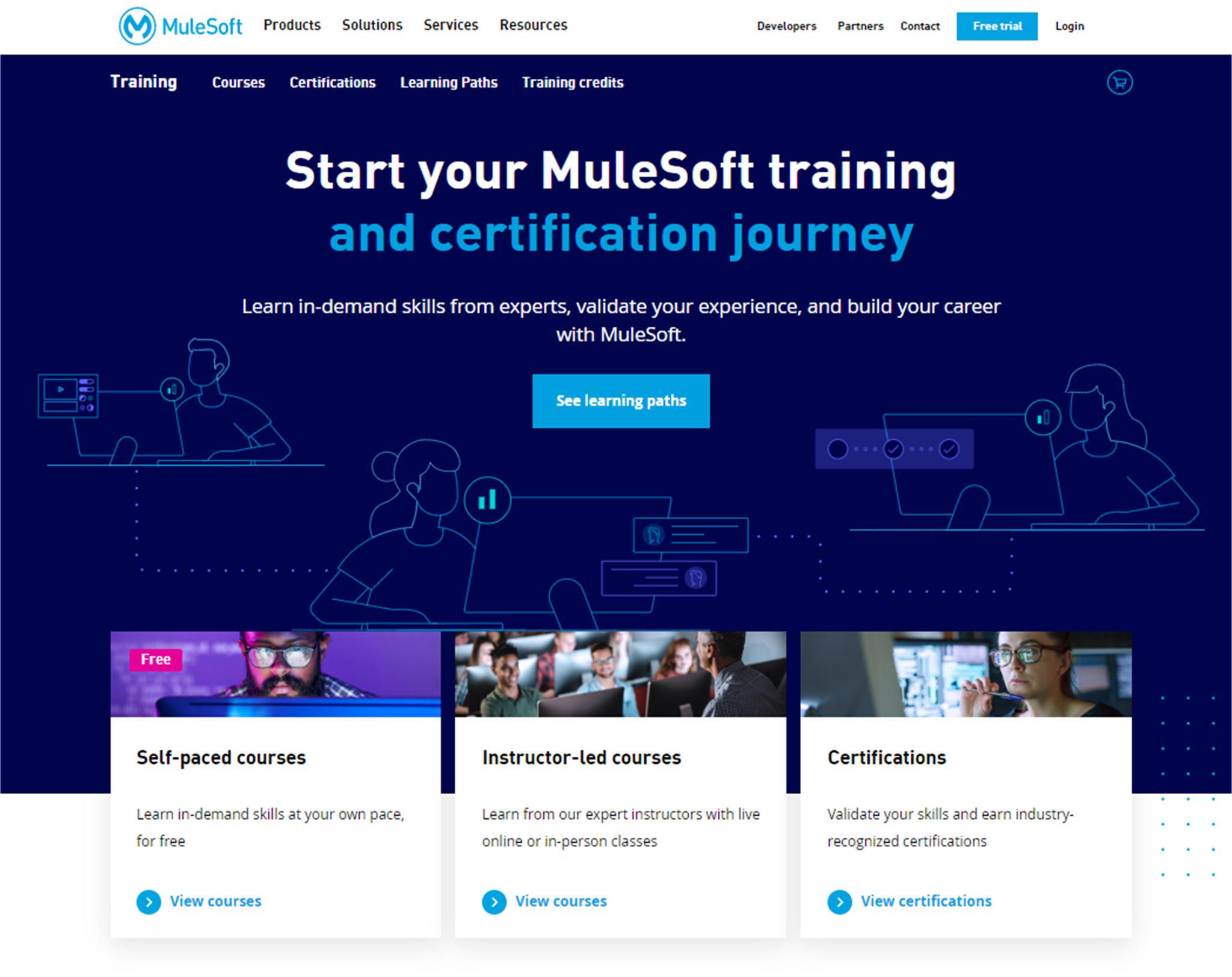
The earlier version of the site had one CTA button above the fold. Users weren't certain what a "learning path" was and if clicking the learning path button would help them choose the right training or certification. All of the other CTAs were below the fold, so many users didn't scroll down to find them.
Earlier version:
Redesigned:
2. Clarify training offers
Top-level cards
In the earlier version of the homepage, the card titles focused on the delivery method of the training, instead of how the trainee learns.
Earlier version:

Redesigned:
I shifted the focus from whether it was a self-paced or instructor-led course to how the trainee would experience the training.

3. Improve discoverability of training courses
We wanted to increase the users' success in finding the courses they want. In the earlier version of the homepage, the CTAs took the user to a learning path page, where they needed to click on their role (which didn't always match the name of their real-world roles), then look through the courses for that role to figure out which one to sign up for. The other CTAs on the page took them to the course catalog, filtered by self-paced courses or instructor-led courses, so the user was confronted with a list of courses with not a lot of context for which course applied to them and their work.
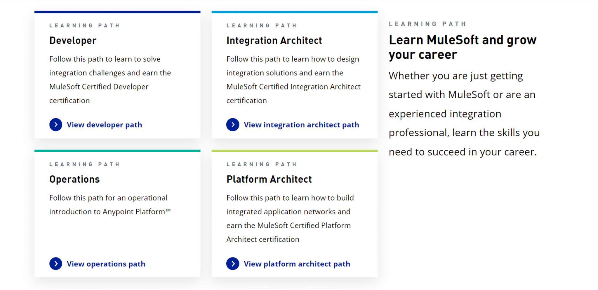
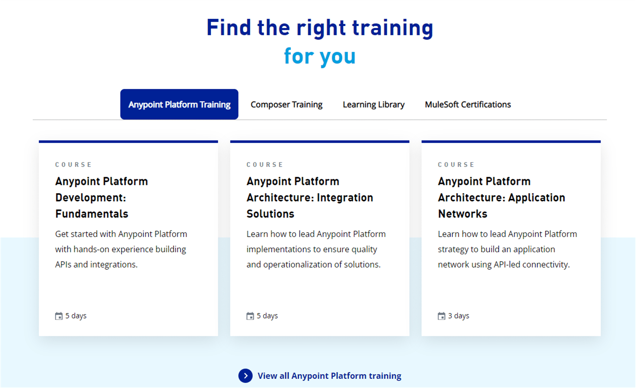
In the redesigned version, we added a section that provides mini-descriptions of the learning paths on the homepage, as well as a convenient and easy-to-use filter to narrow the list of trainings by the product the user wants to learn, by free resources (in the Learning Library), or by certifications.
Earlier version:

Redesigned:
4. Convey the benefits of training and certification
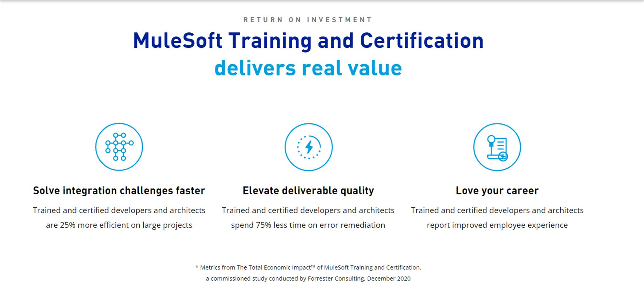
Many of the users who come to the site want to know if going through the training and getting certified will be worth their time and money. The earlier version of the homepage had a few sentences about the value, but didn't really highlight the return on investment with concrete benefits trained and certified developers and architects gain.
Earlier version:
There's a one sentence description in the hero panel that conveys some of the value. The user can easily miss this, because they often read the title and the CTA, not the descriptive text under the title.

Redesigned:
I emphasized the benefits of career growth and success in the general description of the learning path, and we added a "Return on Investment" section that highlighted benefits described in a study conducted by Forrester Consulting.

